Egalitarianism of the dead

We’ve reached the half-way point in the semester, which means that my students have turned in and received midterm grades (for this Tumblr archiving and contextualizing examples of digital death) and I have received my midterm course evaluations.  One of the requests for the second half of the semester is that the learning goals of the course be updated to reflect progress so far.  This has gotten me to thinking about what I’d *like* them to answer if faced with Caleb McDaniel’s (excellent) course eval question  – “what is the most important thing you have learned in this class?”

For me, one of the most important theme of the semester has been the ways in which structures of power and inequality play out, even in death.  This should come as no surprise.  Power, deployed through assumptions and expectations about gender, class, race and more, shapes most aspects of our lives.  It is in no way shocking that it might also shape our deaths.

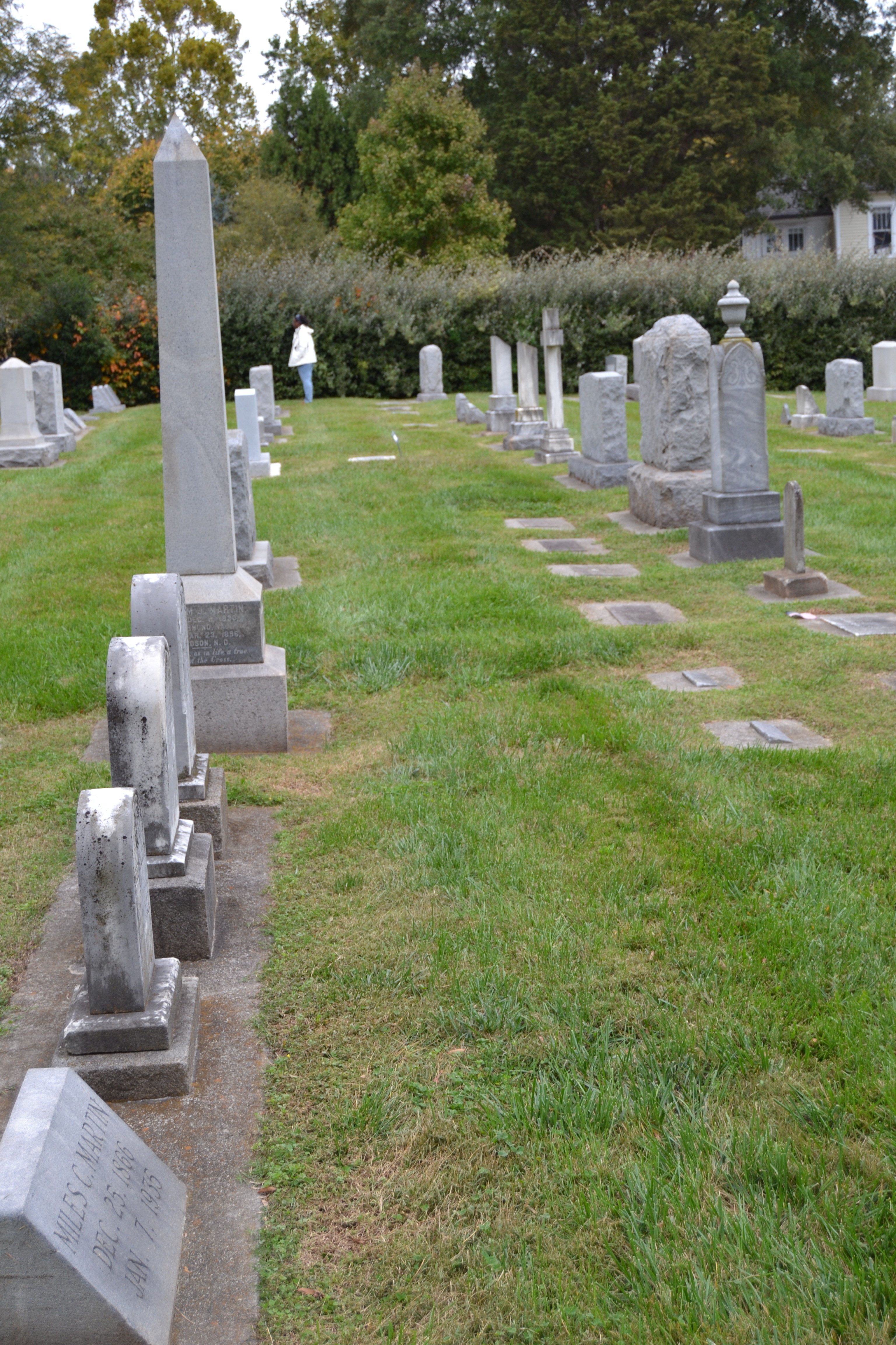
These structures of death and inequality were made visible in a field trip we took today to the Christian Aid Society cemetery.  This block of land – carved out of the farm of a local elite in the early 20th century – contains graves that date back to the early 1910s, but is also a still functioning grave yard.  Most of those interred here are African American, and while some worked for the college, it is not official college space.  It is an evocative place – the stones are not ordered in neat rows, and more than a few are marked “unknown” or with the small metal plaques that funeral homes leave as temporary stand-ins for gravestones, but which remain the only identifier for years-old graves.

Christian Aid Society Marker

Christian Aid Society Cemetery

This cemetery stands in marked contrast to the space owned by Davidson College, which is reserved for those affiliated with the College.  As a result, without any overt policy of class or racial segregation, it is space in which overwhelmingly white and elite people are interred.

Davidson College Cemetery

While I hope that these students leave the semester with a better grasp of how theory has practical application, with some understanding of what it means to memorialize and learn, I hope that one of the biggest take-homes will be about the ways in which structural inequalities manifest in death and how those inequalities in turn shape the production of historical sources, the curation of archives, the preservation of some materials, and the neglect of others.

New directions in disasters and resistance

Last week I had the pleasure of moderating a panel at the American Studies Association.  We ended up running our panel as an (incredibly generative {for me, at least}) workshop, so I didn’t formally give my comment.  I like some of the ideas in it though – enough for this maybe to be the germ of an historiography article, so I thought I’d share it here.


d3.js + R > Gephi (or, why network analysis helps with history)

Gephi is a very useful tool.  I’m very much looking forward to the new release that seems always on the horizon.  In the meantime, though, every time I open Gephi it crashes, and then I dive down a long rabbit hole of trying to re-write the program code, and then I get angry and go home.  So I’ve been delighted to find that a combination of R (for manipulating and analyzing the data) and d3.js (for visualizing the data) does most of the work of Gephi with much less frustration.

I’ve been using Kieran Healy’s work on Paul Revere and network centrality and applying it to a cohort of men who served on the boards of philanthropic organizations in New York in the 1840s. I am particularly in the officers General Relief Committee for the Relief of Irish Distress of the City of New York. These men – Myndert Van Schiack, John Jay, Jacob Harvey, George Griffin, Theodore Sedgewick, Robert B. Minturn, George Barclay, Alfred Pell, James Reyburn, William Redmond and George McBride Jr. – were deeply politically connected, but don’t seem to have had much of a relationship to one another.

Healy’s script, and Mike Bostock’s d3 blocks helped me to build a matrix which tracked relationships between philanthropists via organizations, making note of the number of organizational connections that different pairs of men shared; and another matrix which tracked relationships between philanthropic organizations and social clubs via philanthropists, making note of the number of men that each organization shared.  I used the former to build a force-directed network diagram, which, in combination with some R based analysis, suggests that while the New York Famine Relief Committee officers didn’t often serve on other committees together, they shared other social connections.

For example Jonathan Goodhue was not a member of the famine relief committee, but served on other committees with nearly every General Relief Committee officer.  Of the New York famine relief committee members, Jacob Harvey was the most centrally connected member.  This data has pointed me in some new archival directions, but also give a much better sense of the ways in which people were connected to one another than comparable textual descriptions might do.


I also built a network diagram showing relationships among different newspapers reporting on the famine, which cluster newspapers more inclined to cite each other.