Movable maps

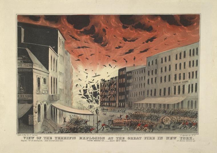
In trying to explain the set of feelings I have about my impending move west, I find myself frequently using the phrase “I am deeply, deeply, natally from New Jersey.”  In saying that, I am telling a little bit of a fib (I was born in New York City, but quickly thereafter transported to Montclair, NJ) but the spirit of the claim is true.  On my mother’s side of my family, people emigrated to America (usually from Ireland), come to Essex County, and stay there.  My great-great-grandfather – Edward M. Waldron – emigrated in the 1880s.  He married a woman whose own father (my great-great-great-grandfather – James Moran) had emigrated in the 1840s.  Other branches of this particular family tell similar stories.  We were from Ireland, and then we were from Essex County.

All of this has gotten me thinking recently about the work that maps do for us – in terms of memory, mythmaking, and claimsmaking.  I came across this map of Essex County in the 1850s (comprising more space than the county does now) and showing “the names of property holders from actual surveys.”  It is difficult to reconcile the suburbia that I grew up in as empty farm lands, but moving through the space of the town now, it is possible to imagine what a hotel at the corner of Bloomfield and Valley might have looked like, or that a chemical works, paper mill and cesspool once occupied the space now taken up by a discount liquor store.  With some (very) few exceptions, that past is invisible to us – but imagination can put it back in place.

It is not quite the same thing, but I’ve been doing some imaginative geographical work of my own of late.  Just over one year ago, I got my first tattoo, which was based on a 1927 street map of Montclair.  The tattoo is of the area in which I grew up – as I said at the time, leaving New Jersey makes me want to indelibly mark it on my person.  A month ago, I added to the map, this time showing the area of town where my partner and I currently live.  The two maplets are connected by the railroad – which famously collapses space and time, but which also collapses space on my body.

IMG_1529 copy tattoo


Just as I like the idea of imagining the past haunting the present through old maps, I like the idea that these New Jersey spaces will haunt my body as I travel and age.


Fire! July 19th, 1845 – The Financial District

On July 19th, 1845, New York City caught fire.  It started in a whale oil warehouse in lower Manhattan and spread quickly, eventually engulfing warehouses full of explosives.  The fire burned for over eight hours, and when it was finally put out, 30 people had died.

The fire was commemorated in popular prints in the 1880s, two of which currently held by the New York Public Library:

View of the terrific explosion at the Great Fire in New York. From Broad St. July 19th, 1845.


The Fire Of July 19, 1845 — The View At Bowling Green.

I came across the fire while trying to figure out the names of public health institutions in 1847 New York.  The NYC guide I’m using – Doggett’s New York City Directory – for 1845-46 contains a list of the 217 buildings destroyed by the fire, and the names of the hundreds of people who were displaced by it.

I thought it might be fun to map the extent of this fire, described in Doggett’s as:

“The disastrous fire of the 19th of July, 1845 – long to be remembered by the citizens of New-York – having laid waste a considerable portion of the business section of the city; and causing, consequently, the removal of numerous business men and firms.”

Ever systematic, the guide went on:

“The total loss by the late fire has been variously estimated at from $5,000,000 to $8,000,000.  The fire commenced about 3 o’clock, A.M. and was not subdued till 11 o’clock A.M., a period of eight hours.  Supposing, therefore, the total loss to have been $6,000,000 – the average loss per hour, was $750,000; the loss, per quarter of an hour, was $187,500; the loss, per minute, was $3,125, and the average loss per second, was $52.08 1/2!  Bank notes, of the denomination of one dollar, would not burn more rapidly in a common fireplace than was the property consumed by this conflagration.”

I have no sense of the relative value of the area destroyed today, but it encompasses much of the financial district of present-day New York City.


These are a few of my favorite maps

I’m putting together an aspirational syllabus for a digital humanities/mapping course, and have been thinking about my favorite maps, and why they work so well.  Here is a very-not-complete list of my current greatest hits:

Slave Revolt in Jamaica, 1760-1761: a cartographic narrative.

This is, by far, my favorite digital mapping project.  I’ve seen Vincent Brown speak on it, and I was quite impressed by his articulation of why we need a map like this to understand enslaved rebellion.  Because records of these uprisings tend to have been produced by ruling elites who were actively opposed to representing enslaved resistance as anything other than barbarous and futile, it would be easy to think that this uprising – and many others like it – were haphazard and poorly planned.  Brown’s map, on the other hand, reads the colonial archives against the grain to show us the strategy that underlay this revolt.  I love that he uses sources in which obscuring enslaved agency is a feature rather than a bug to highlight that agency.

Touring the Fire

A little less high tech, but still a great example of how a geospatial perspective can give us new, or at least different information about an historical event.  One of the persistent fictions about the Chicago fire is the culpability of Mrs. O’Leary’s cow, so it’s interesting to see how the fire spread, but also to treat the path of the fire like a walking tour, and to map it onto Chicago’s geography today.

London Soundmap

This is just ridiculously cool (and reminds me of a book I just finished about London’s underground rivers).  It borrows aesthetically from the iconic tube maps, but instead of information about subways gives us the sound of underground waterways.  There are some other great soundmaps on this site, including ambient London noise, the sound of the Thames estuary, and a handy map of the most common sounds in different parts of the city.  The whole thing is worth exploring.

While we’re talking about aural mapping…

Here’s a project which uses immigration data to create a true aural map of changes in American demography over time.

And finally, everything NOAA does, but especially their geospatial services.

Now it’s all about convincing the undergraduates that maps are cool…

Google map engine and Charleson donors

Although the Google map engine API is meant for businesses, there’s a lite version for non-business map geeks.  I like this tool because it’s easy to embed a lot of data into the map.  Here’s a quick version of the Charleston famine donors map that I’d previously made just using Google maps and dropping “pins” in places where donors were located:

[googlemaps https://maps.google.com/maps/ms?msa=0&msid=214677819635357292007.0004d08361291f904d1c3&ie=UTF8&t=m&ll=34.016263,-82.283671&spn=3.169364,6.305034&output=embed&w=425&h=350]

All of these donations were printed in Charleston newspapers, and when I first started mapping them I was struck that (1) many of the donors printed in Charleston papers didn’t seem to live in Charleston and (2) how many of them were slaveowners.
The new map is here.

On starting new projects

I’m deep in the next-year’s-research planning phase of the summer, which is mostly comprised of figuring out what other donor communities I want to look at for the book manuscript.  I chose sites for the dissertation largely based on news production – locales in which a lot of news was being produced, reproduced and consumed – but for the book I’ve been thinking about how to better center the experiences of non-elite donors, which means looking for places from which donations flowed, rather than places in which people were merely reading about the famine in Ireland.  As part of this, and as part of a related project to collect the names of donors to a wide range of 19th century philanthropic projects, I’ve been working on a database which tracks not only individual donations, but also biographical information about donors.  I’ve been using this data – and in particular donations to national famine relief funds (the American Society of Friends rather than the New York Irish relief committee, for example) to try to map places where donations came from, but that I haven’t yet explored.

So: a very few, very preliminary findings:

  • Most of these donations are coming from cities.
  • Many are on behalf of relief committees of entire cities – it’s not clear yet whether these are Quaker relief committees or ones without religious (or with another religious) affiliation, but I hope that’s something I’ll be able to check out at the Haverford Quaker archives.
  • Of those donations made on behalf of urban relief committees, the people doing the collecting were almost entirely merchants.

The orange circles are the places I’ve yet to explore – lots to do!

CRC donor locales

100 Years of Isis

For those history of science types out there, I just finished working on a project with David Hubbard, Anouk Lang, Kathleen Reed and Lyndsay Troyer for the (now completed) IVMOOC on the History of Science Society’s journal, Isis.  We ended up with a visualization that tracked changes in authors’ locations from 1913-1937 to 1988-2012, and also mapped the dominant themes in Isis article titles from 1913 to the present.  There’s probably still a lot to do with the history of the journal, but I think we made a pretty good start.

100 Years of Isis8567870268_40c9dd6c70_c

Famine news in Indian Territory

The map I use as a header is one of my favorite nineteenth-century images, because it shows transportation networks, both across the Atlantic and within North America.  While it’s instructive to see the various stops that information made as it crossed the ocean, moved up and down the coast, and into the American interior, the best thing about the map, for me, is that I can do things like this:

Cherokee Advocate citation network 3